The other day, Koldo and I watched the most charming French movie called “The Young Girls of Rochefort” starring Catherine Deneuve and Françoise Dorléac. I was impressed by the generous and fresh use of color they used in the movie and how well they mixed it all to make it work.
One of the most charming parts was seeing the two sisters wear complementary clothing; Françoise, the brunette, in gorgeous yellows and Catherine, the blond, in pinks. They skillfully alternate in colors as the movie goes on. This delightful complementary color-matching theme continues throughout the movie with all of the characters, extras, objects, and scenery.
I’ve mixed together some fun color palettes to compliment some of the scenes in the movie for you.
Here are some ideas on how you can use these palettes:
- Save the image to a Pinterest board for a fun project you’re working on.
- Use for your website: bright contrasting colors for accents and features and neutrals for backgrounds.
- Use for styling up your social media graphics for a fresh look.
- Use for decorative accents in one of the rooms of your home or go all out with bold paint colors.
- Accessorize your style with jewelry, handbags, or shoes. I personally love the idea of mixing a faded pastel with a bright complimentary color. For example, mixing a pale mint handbag with a bright turquoise top.
You can download the palettes in Adobe Swatch Exchange (.ase) format underneath each photo, which will work in all Adobe programs. I’ve also included a .zip file with all of the palettes at the end of this post if you’d like to download them all at once.

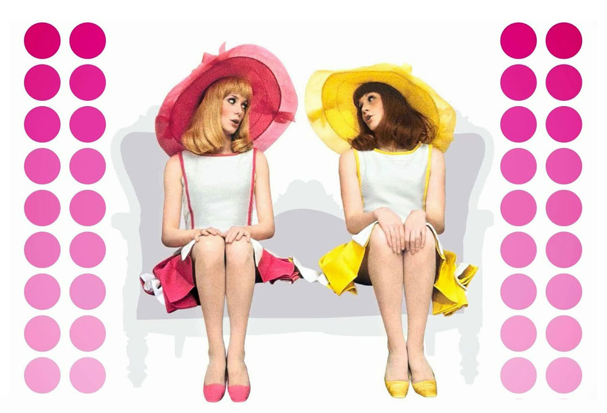
Sisters; fresh, fun, and doe-eyed. Download this palette.

I couldn’t keep my eyes off of these lemon placements in the movie. They add a fun burst of color throughout all the bar scenes. Download this palette.

There are a LOT of colors in this scene. Yet, somehow it works. Download this palette.

I appreciated the primary color mixing they did for the men here. They’re wearing bright and bold colors, rather than pastels. Download this palette.

Nice touches of pastel in the background and objects. Download this palette.

More pastel love. And Gene Kelly in pink! *swoon* Download this palette.

This time the sisters have swapped their yellow and pink looks. Download this palette.

This couple’s color scheme is highly unusual and hard to mesh right. And yet, they pull it off again! Download this palette.

Pastels and dancing couples in love. What could be better? Download this palette.
Deneuve is as lovely and doe-eyed as youth can be in this movie. The appearance of the ever-graceful Gene Kelly in the movie was a nice touch although his part was small. The movie does have a bittersweet feel though when you realize that Françoise Dorléac, the co-star and real-life sister of Catherine Deneuve, died in a tragic car accident a few months after the movie was made.
Color ideas and inspiration sometimes find you in the most unexpected places. I was surprised and delighted by this little visual feast and I hope you enjoy it as much as I did.
Are you planning on using any of these schemes in a project of yours? If so, we’d love to hear about it!

This is so amazing and I love the color palettes you created! Simply divine. 🙂
Thanks so much, Nathalie!! 🙂